I have finally completed the front cover and contents page for my student magazine 'The Pupil Paper' with the help of a series of questionnaires, polls and feedback from my target audience. In this evaluation, I will discuss everything that went into the process of creating the magazine.
Who would be the audience for your media product and why?
My student magazine is aimed at sixth form students between the ages of 16-18. I targeted it at both males and females to give it more variety, so it is likely that more people will read it as I am reaching a broader market.
In what ways does you media product use, develop or challenge forms and conventions of real media products?
 The typical conventions of any magazine is having the basic format, like a masthead,headlines, cover lines, graphics, main background image and so on. I have included all of these factors in my front page and contents page because they are essential to magazines, to deliver the correct information to the audience and attract them via the format. I haven't differed my magazine a lot from the stereotypical types, as I have included a strap line, a background image of a male and female student to appeal to both genders, and other common conventions. My front cover is quite fun and wild, but still has that degree of formality that a student magazine should have, as there are cover lines related to educational aspects of the college, such as "Exam Stress Cures". The bright, clashing colours add the colloquial tone to the cover, making it appeal more
 to young people, without looking too childish or disorganised. The contents page is as colourful, with the use of a lot of yellow, hopefully making it attract people further. The contents page is vital to show everything that is included in the issue and to make sure its effective so readers continue to read it. Because 70% of people get magazines on the spur of the moment, they would look at the contents page in order to get an insight into what's included. If they don't like the look of it, they won't continue. This is why I've made sure my contents page is effective, by branding it with 'The Pupil Paper' at the top and added some images in, along with a letter from the editor, which is common to a lot of magazines.
How does your media product represent particular social groups?
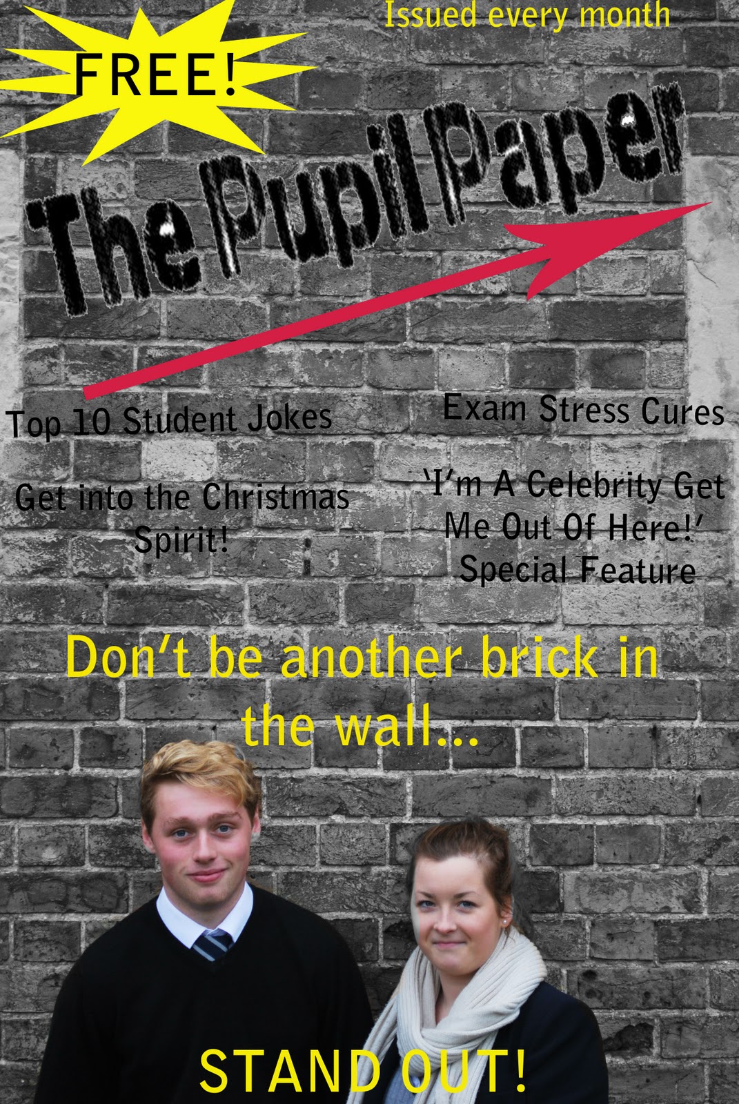 The social group that my student magazine represents is teenagers between the ages of 16-18 as that is the age of sixth form students. As mentioned briefly before, the front cover background image is a girl and a boy, standing in front of a plain, black brick wall. This grey scale was created in Photoshop which I'll discuss later. The strap line is "Don't be another brick in the wall...Stand Out!" This is encouragement for students to not conform to the ordinary and they shouldn't be afraid to be different. The students are wearing sixth form uniform, look relatively smart and are smiling. This overall creates a positive image of this group of students. The language is normal-not too formal and not too informal. This hopefully represents how this age group are still young and have fun, but at the same time are mature and aren't childish any more. This again adds positivity to the target audience. I have used only one image on my front cover, which is the background image. If I had put more, the page would look too disorganised and would be too much for readers to take in. The level of organisation also represents attitudes of maturing teenagers. The contents page is similar in the way that it's nice and bright but still has that formal tone to it. It has a series of small pictures, of sixth form students and Google images related to special features in the issue. This shows variety and gives a more balanced ratio of text to graphics.
 What kind of media institution might distribute your media product and why?
 It is unlikely that other media institutions will distribute this particular student magazine as it is specific to St. Edmunds College, so only the school will distribute it because it contains aspects of college life and includes features on certain teachers and students. Even though we already have a college magazine, like 'College Life' and 'Avita Pro Fide'. For one of my textual analysis', I looked at 'Avita Pro Fide', the magazine for Old Edmundians. It was much more sophisticated that my student magazine, as was 'College Life' as it is a magazine for parents. Therefore, 'The Pupil Paper' offers some variety from the formal tone of the common school magazines. It is also directed at a much younger audience to these other magazines but still an older audience to the student magazine that the school already has, but that is directed at all ages from year 7-13, unlike this magazine.
 How did you attract/address your audience?
The student magazine attracts young people from the bright colours and pictures, but a sense of equality is made by the balance of text and images. It's appealing originally because it's free, so on the spur of the moment students are likely to be interested. The four cover lines on the front cover are some of the main and best articles included in this certain issue. It will hopefully make readers want to look on the contents page for more detail, or even go straight into the magazine. The bright pink arrow that underlines the mast head on the front cover attracts the readers eye and it's pointing to the next page, encouraging them to open the magazine. The contents page is fairly simple and I tried to keep text to a minimum to avoid overwhelming readers with too much on the page.
What have you learnt about technologies from the process of constructing this product?
I have been introduced to a number of new technologies. I had used Microsoft Publisher before but I was educated further in using it for things like cropping the mast head in order to insert it into my front cover in Photoshop. I had briefly used Photoshop before but not a lot and I wasn't too sure how to do a lot of things that are needed for the student magazine. I have learnt a lot in using Photoshop, like smudging, changing colours and effects, enlarging or diminishing things, outlining images and inserting them elsewhere and so on. I feel more confident in using it in the future. Using the school camera during my photography sessions was useful to get an insight into how to work hi-tech cameras and I feel better about using them in the future. I also learnt how to use a scanner to put the front cover and contents pages of other magazines onto my blog. Using Blogger was a good opportunity to expand my knowledge of the Internet and aspects of the media world. I enjoyed updating my blog and it was useful to see some direct feedback from my target audience. I also liked commenting on my peer's questionnaires and polls etc in order to help them with their student magazines too.

No comments:
Post a Comment